
The magic of mushrooms was never a mystery to me. No, I did not grow up in a hippy commune as one could assume - anything but. My mother, a researcher in mycology, simply would talk about her work at home. She’d be waxing lyrical about fungi as the “almighty kingdom” of the natural world, explaining to her skeptical teenage children how science had merely scratched the surface of their seemingly infinite potential.
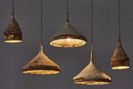
Fast forward a few decades and, admittedly, my mother turned out to be right on this topic too. Research labs are churning out building materials, medicines, cleaning products, textiles, biofuels, packaging, and countless other products from fungi. As a designer, I’m particularly drawn to mycelium applications in the design and architecture industries for their intrinsically sustainable and recyclable qualities.
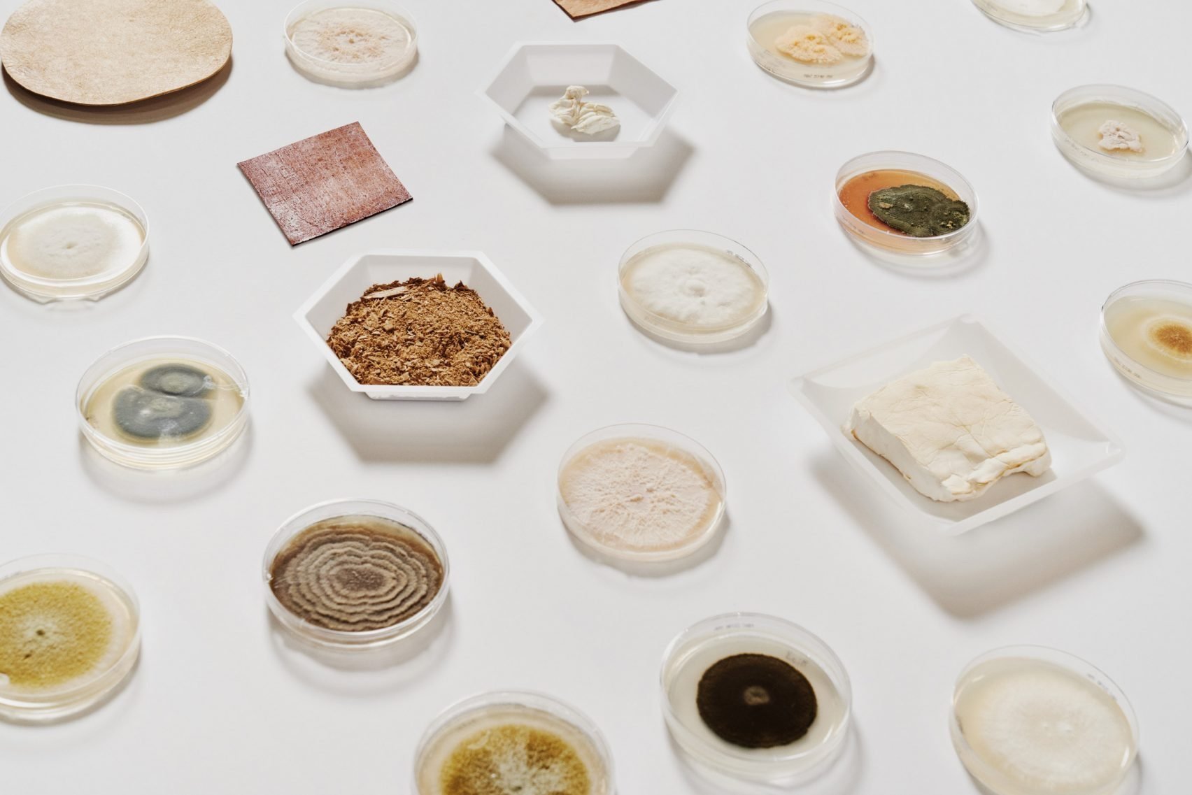
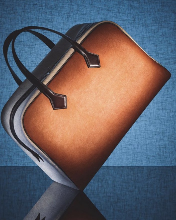
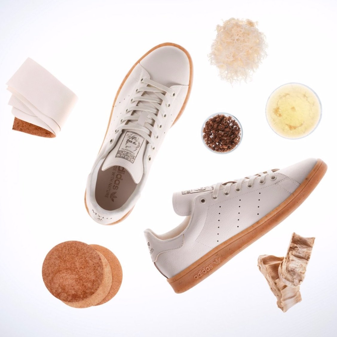
However, you know you’re onto something good when established fashion brands of the likes of Hermès, Adidas and Stella McCartney are designing products with a high quality alternative to leather developed from mycelium.
As we may be on cusp of seeing fungi-based products becoming mainstream, I find myself dreaming of sofas upholstered in soft mycelium leather only to realise that my mother’s legacy is very much alive, well beyond my fungal sibling named after her.
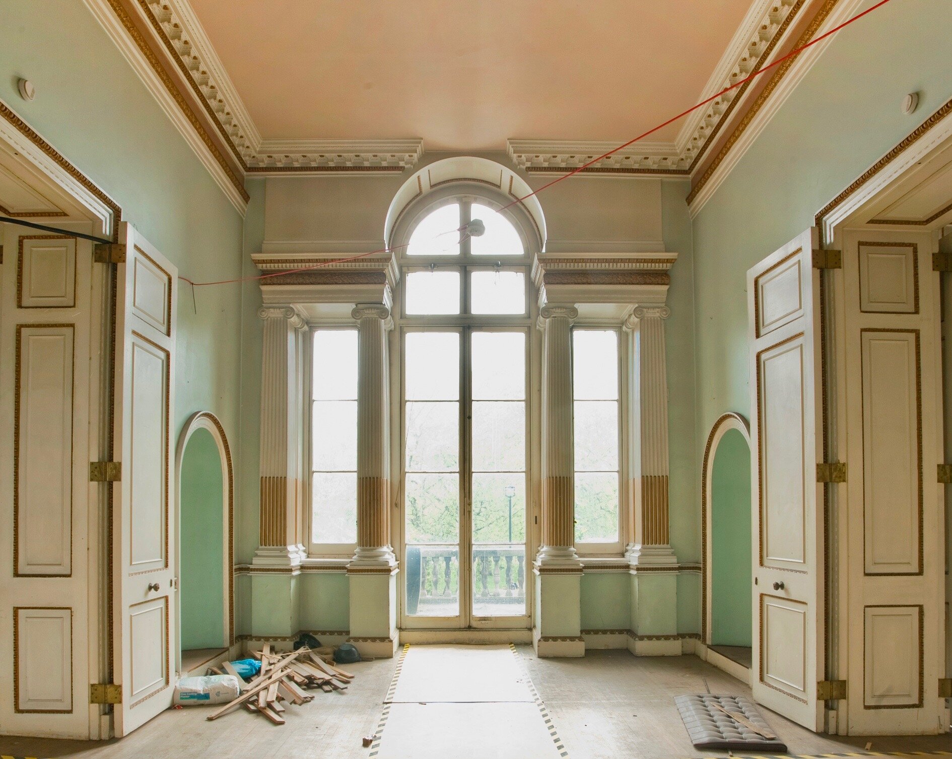
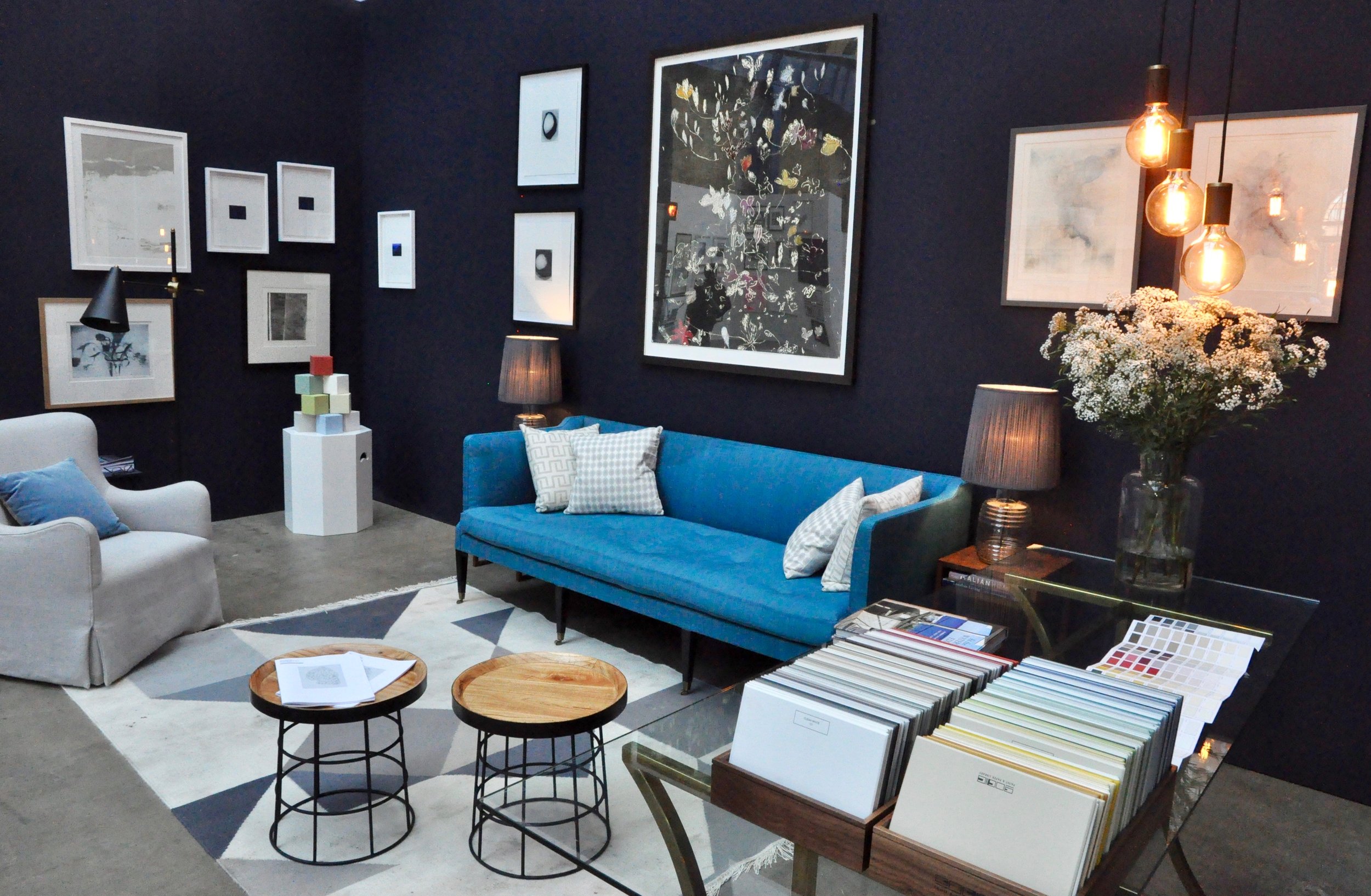
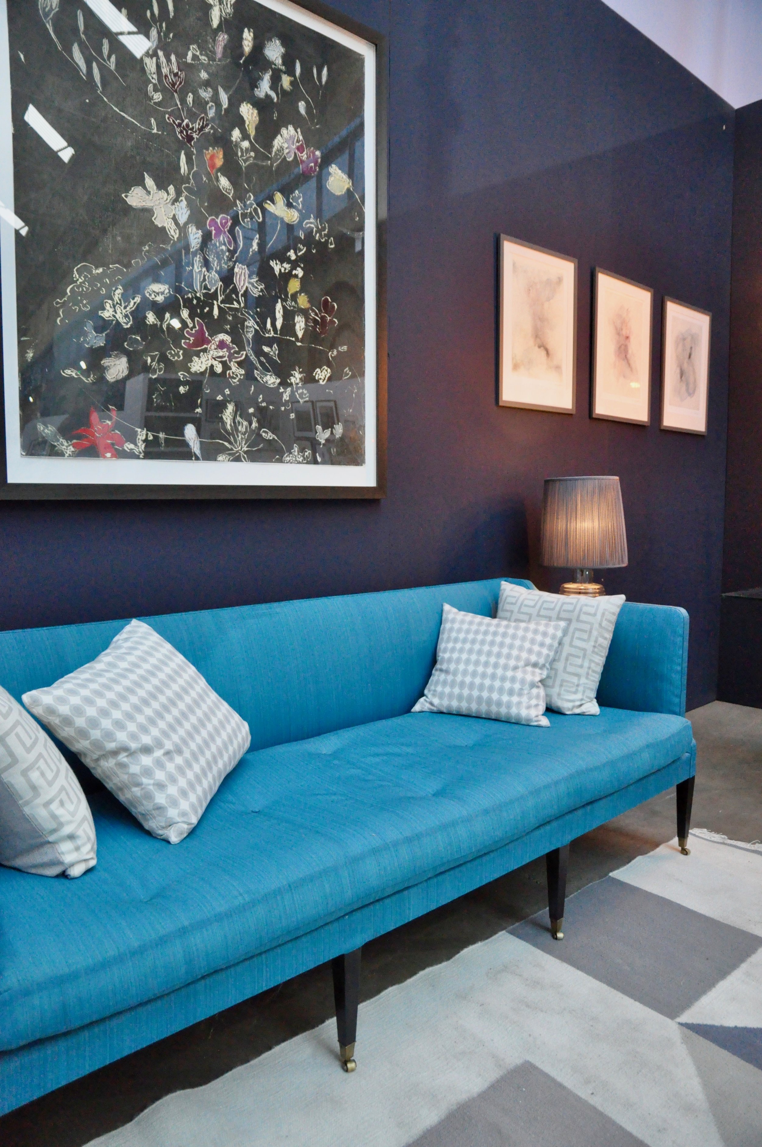
Images: MycoWorks, Mylo, Sebastian Cox