
Theatricality in commercial interiors certainly was a thing long before Instagram - think the iconic Sketch designed by India Madhavi back in 2003. In the era of the selfie, however, creating “Instagram moments” has become an essential part of the brief given to designers in hospitality, retail and even some residential projects.
What makes an interior “instagrammable” , might you wonder? Photogenic appeal seems to be powered by a strong graphic essence, a fearless use of colour, surprising and whimsical elements, playfulness and fun. Interestingly, pink is often the hue of choice - but then, it’s a most flattering colour for all skin tones.
For designers, planning interiors for the gram is definitely a challenge: get it wrong and you’ll create something gimmicky and lacking authenticity, get it right and you’ll hand to your clients a very powerful branding tool, as well as having people flocking to take pics of your loos. Now, that has to be a legacy worth working for.
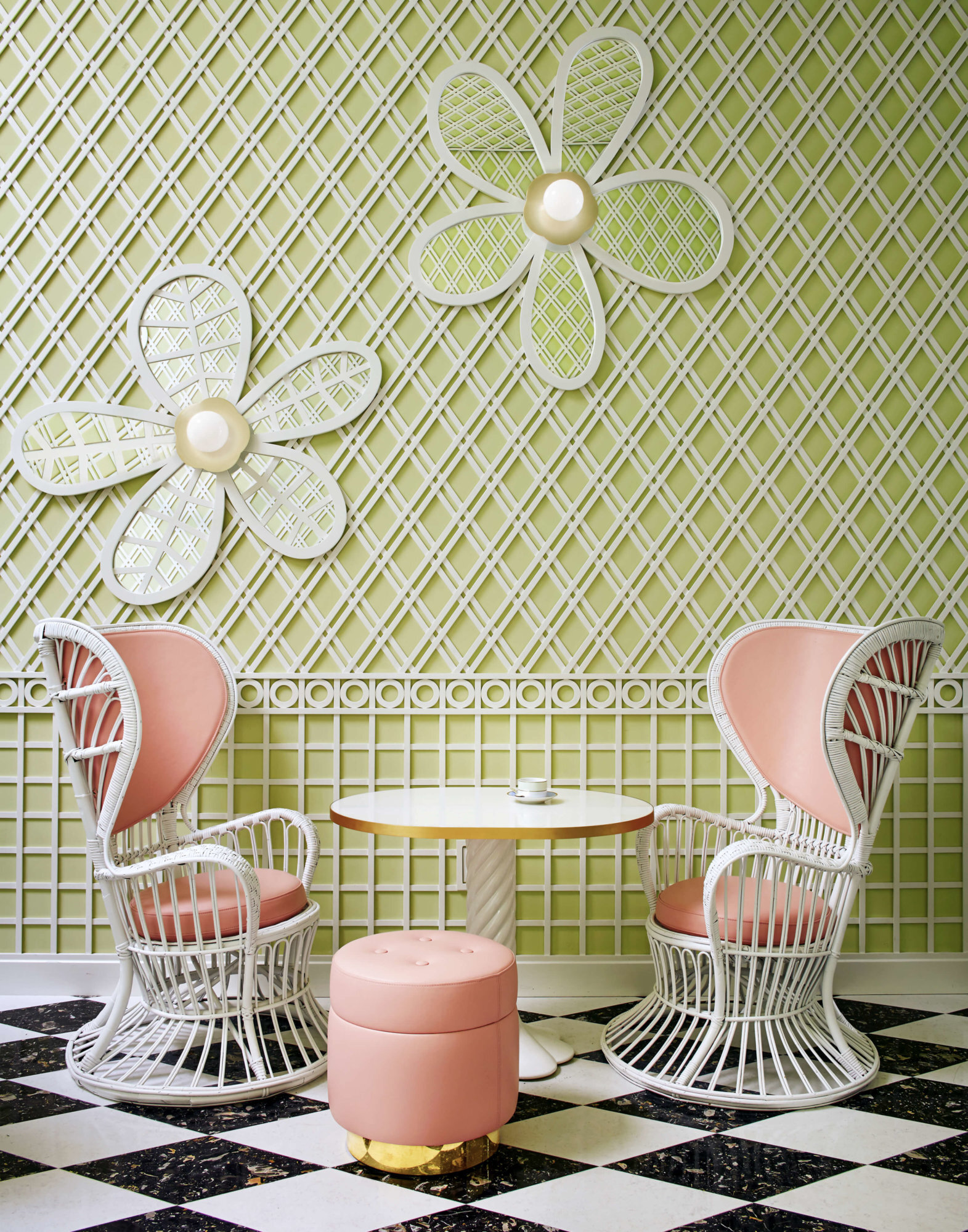
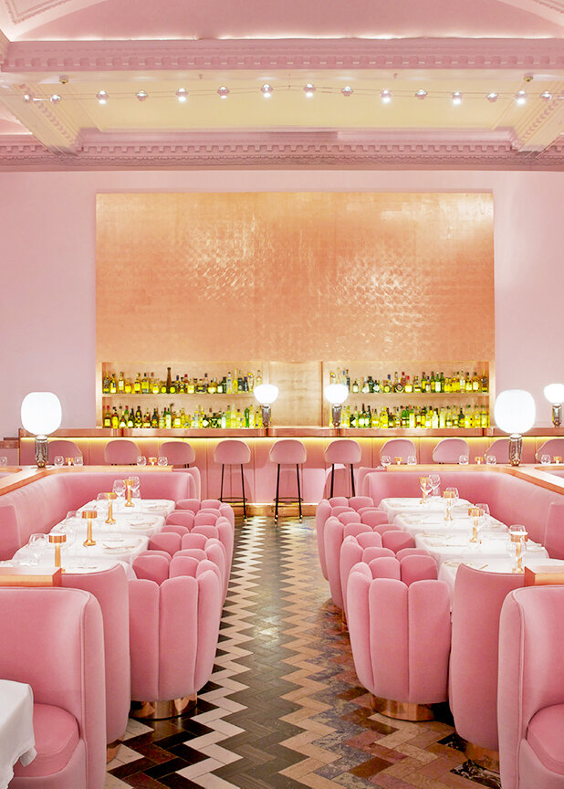

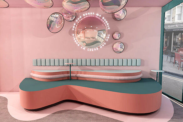
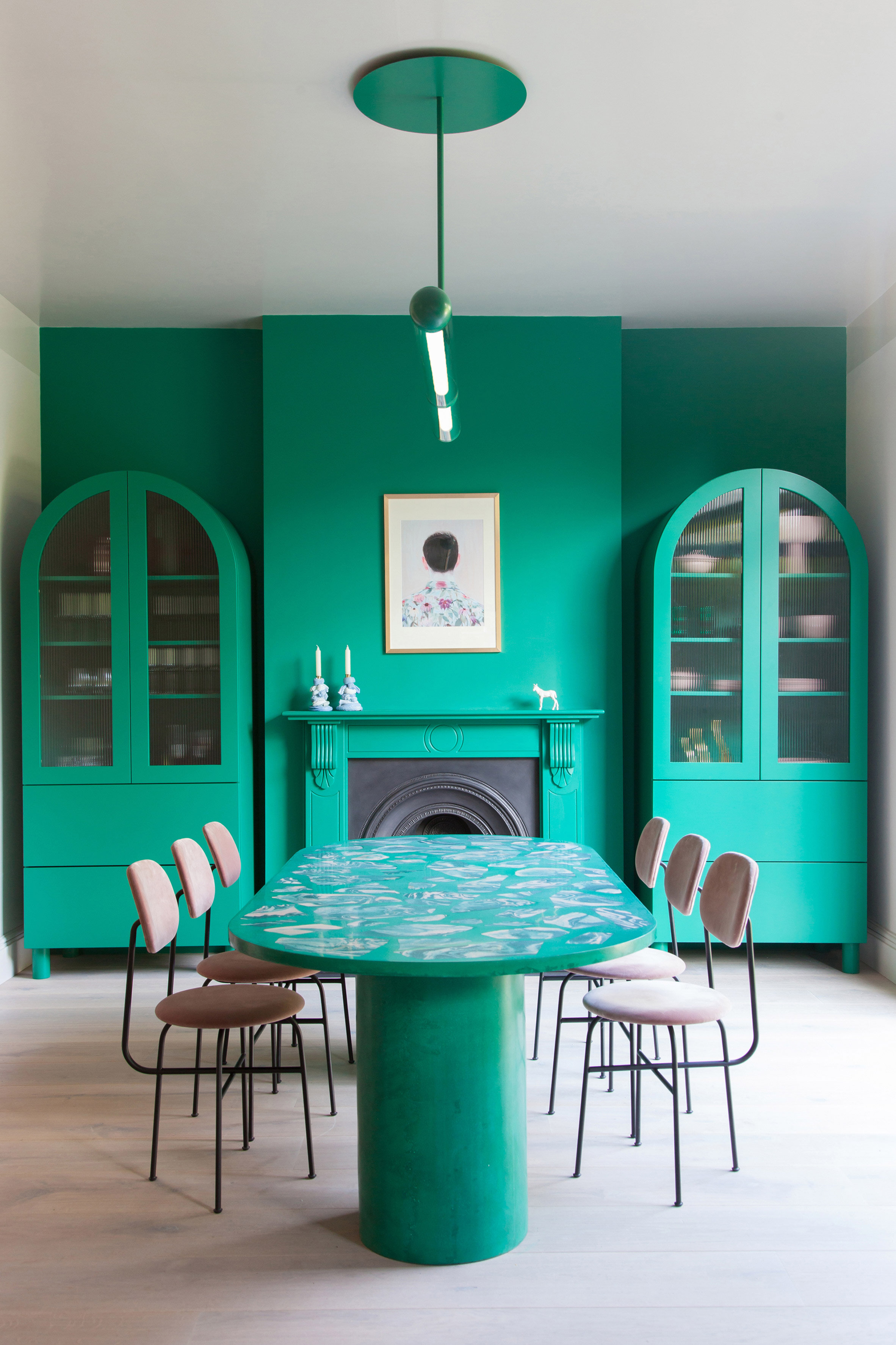
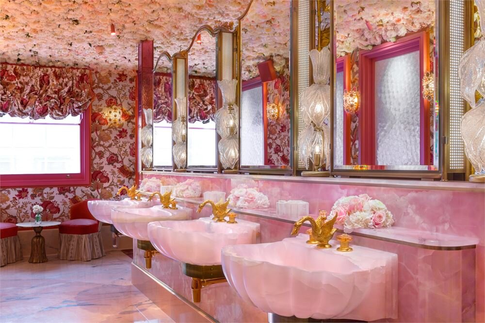
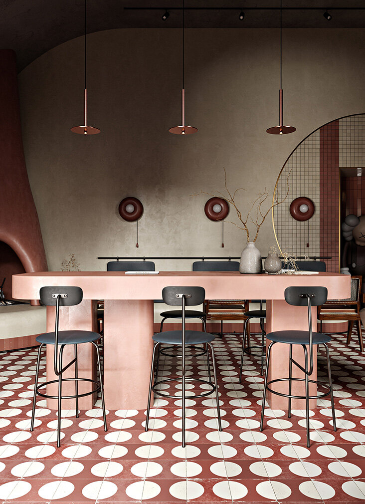
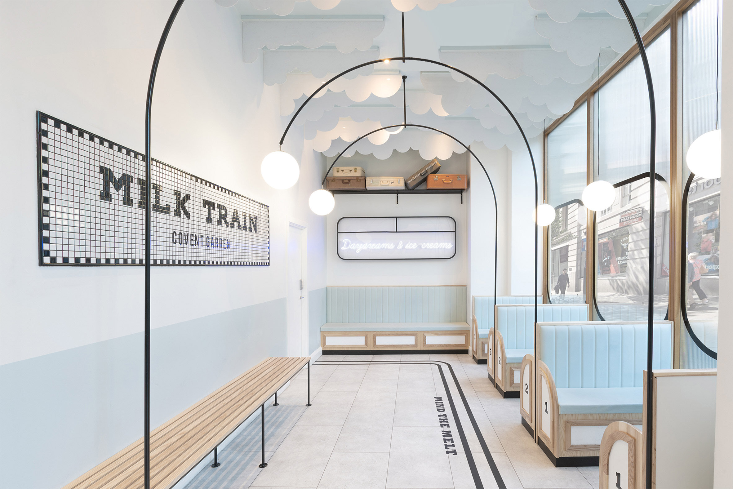
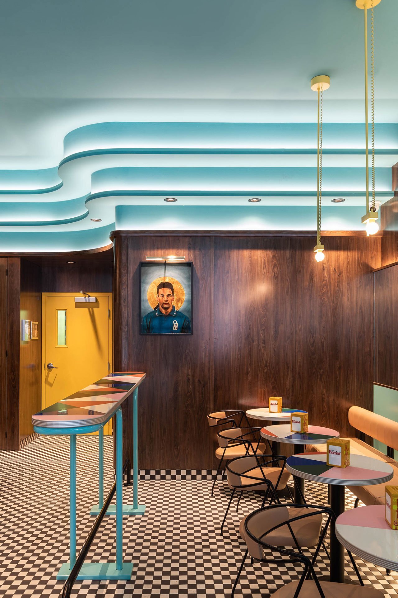
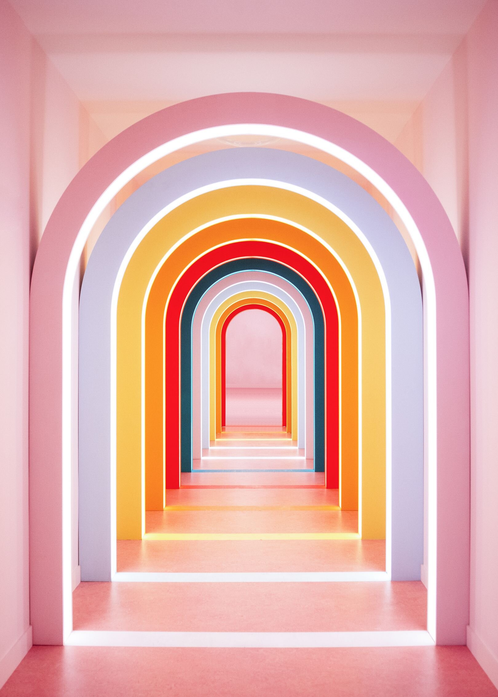
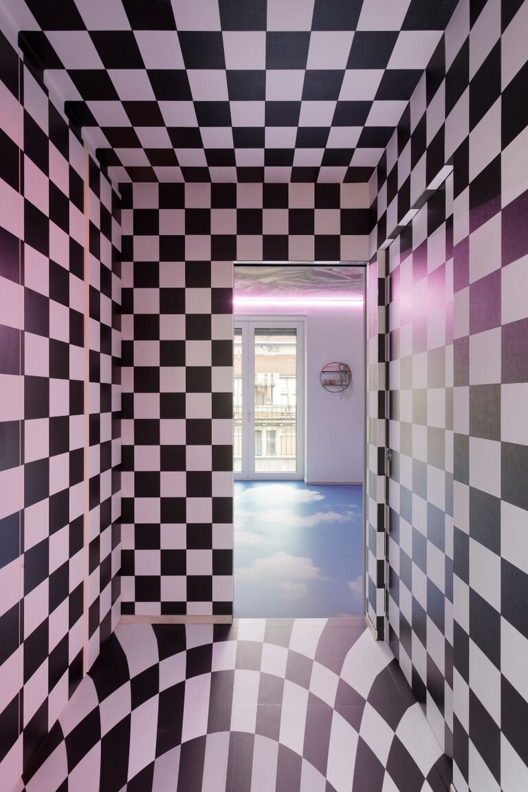
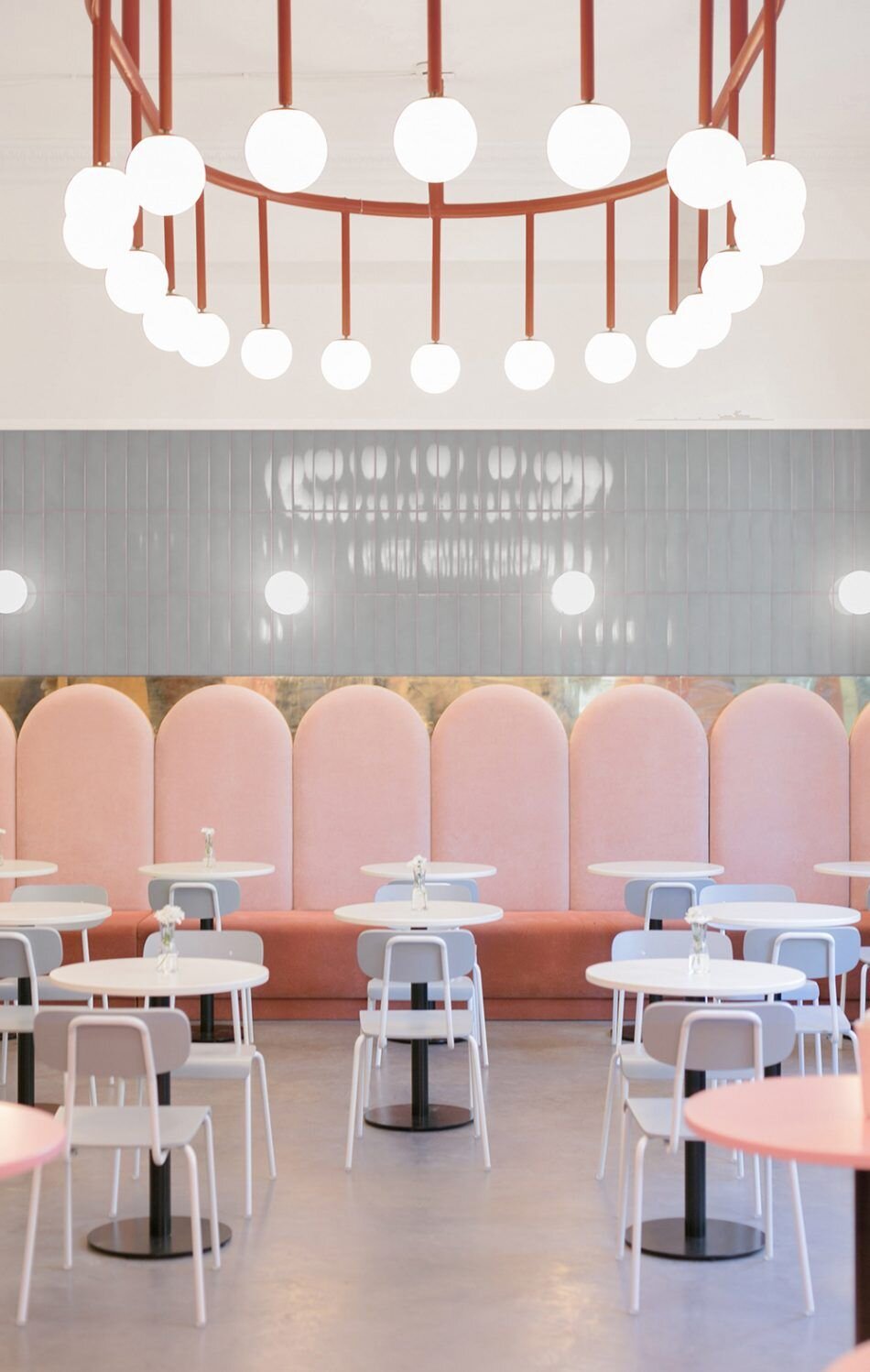
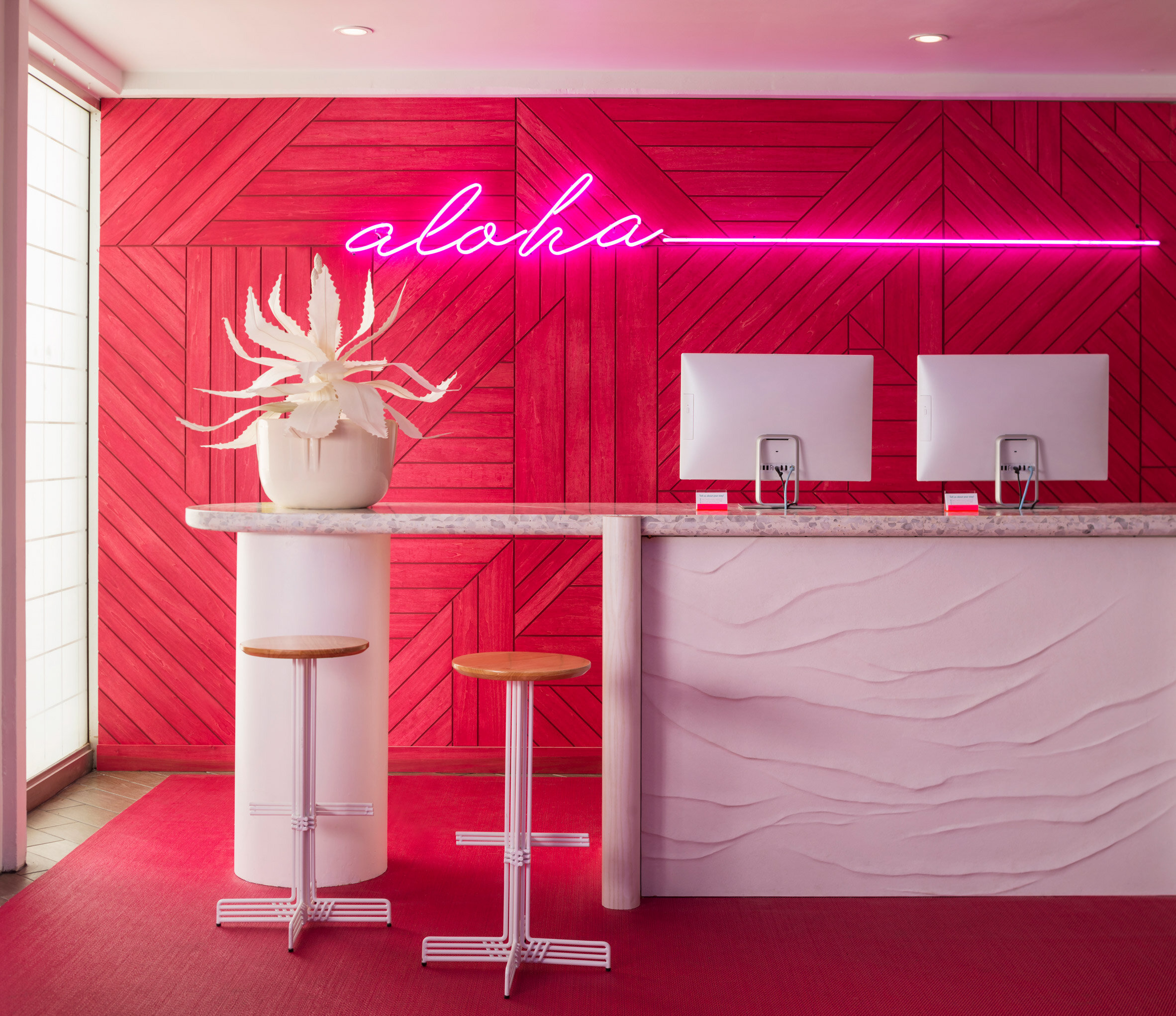
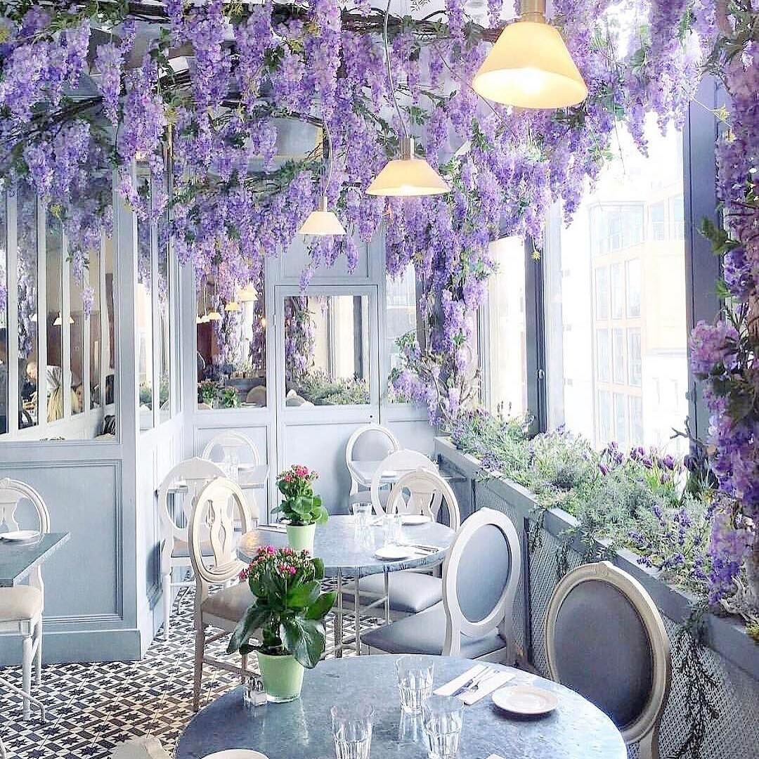
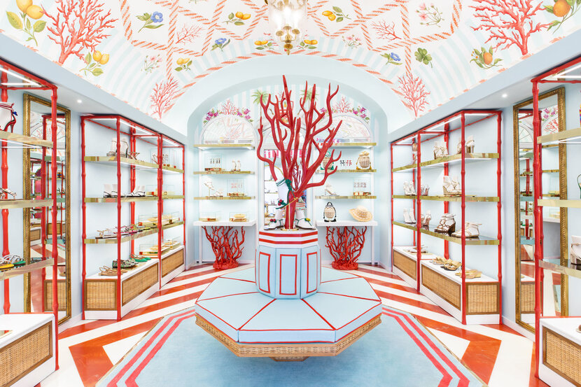
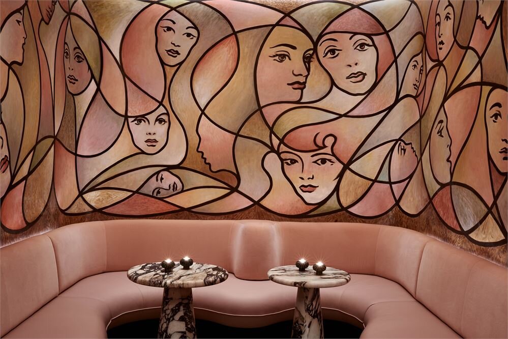
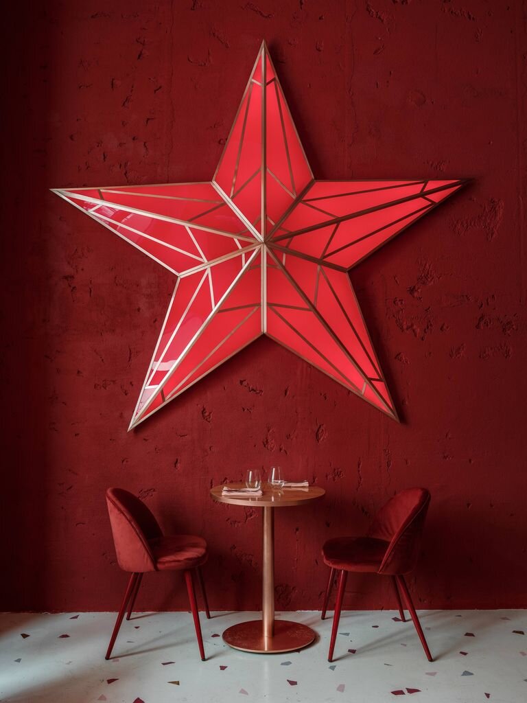
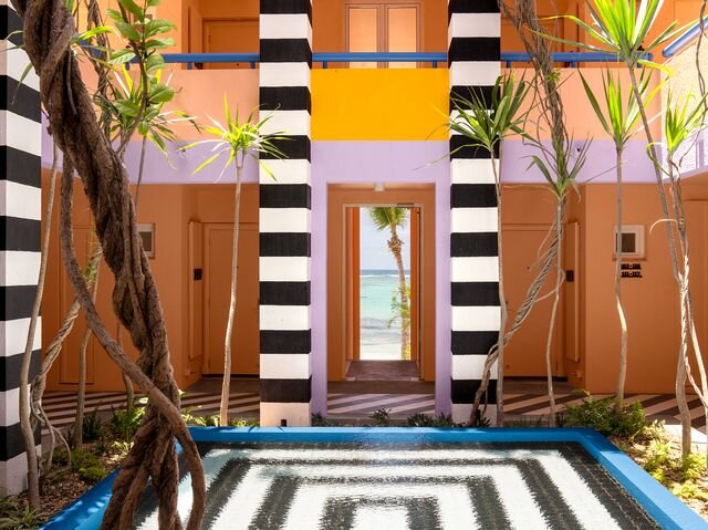
Image source: Sketch - La Durée - Milk Train - Defhouse - Ice Cream Museum - 2LG Studio - Dyce - Buha’i’rest bar - Annabel - Shoreline Hotel - The Berkeley Bar - Caffetteria - Aubaine - Tiffany